Feb 26, 2024 By Team YoungWonks *
Flexbox
Flexbox layout, formally recognized as Flexible Box Layout, represents a pivotal advancement in CSS design, offering a versatile approach to crafting one-dimensional layouts. In essence, it furnishes developers with a virtual toolkit for organizing elements along a singular axis, be it vertically or horizontally, with unparalleled flexibility. Picture a canvas where elements, akin to malleable boxes, seamlessly adjust their dimensions to accommodate content or the prevailing space constraints. This dynamic capability, intrinsic to Flexbox's design, underscores its utility in creating layouts that effortlessly adapt to diverse screen sizes and resolutions. At its core, the essence of Flexbox lies in its aptitude for establishing the foundation of the layout first, serving as the cornerstone upon which the visual hierarchy of the webpage is constructed.
By leveraging properties like flex layout, flex-basis, and flex property, developers wield granular control over the behavior and appearance of individual elements within the layout. The flex layout property, in particular, empowers developers to define the flexible sizing of elements, dictating how they expand or contract relative to the available space. Meanwhile, the flex-basis property sets the initial size of a flex item before any remaining space is distributed among the items. Additionally, the flex property amalgamates flex-grow, flex-shrink, and flex-basis into a single shorthand declaration, streamlining the process of defining flexible layouts with succinct precision. In essence, by embracing Flexbox, developers embark on a transformative journey, where the layout is meticulously sculpted with foresight, laying the groundwork for a seamless user experience across diverse devices and viewport sizes.
What is CSS Grid?
CSS Grid Layout, commonly referred to as Grid, represents a revolutionary paradigm within the domain of CSS styling, offering a sophisticated layout system with unparalleled versatility. Diverging from the singular axis approach of Flexbox, CSS Grid heralds a new era by enabling developers to conceive intricate two-dimensional layouts that transcend conventional design boundaries. By harnessing the power of CSS Grid, developers gain access to a rich tapestry of possibilities, where rows and columns intertwine to form a dynamic framework for structuring content. This transformative capability empowers developers to orchestrate the visual landscape with precision, exerting fine-grained control over the placement and sizing of elements within the grid.
Whether aligning elements along defined grid lines or spanning multiple cells to create visually captivating compositions, CSS Grid epitomizes the epitome of layout sophistication in contemporary web development. It serves as a cornerstone for crafting immersive user experiences, where the seamless integration of content within a grid framework fosters intuitive navigation and engagement. In essence, CSS Grid transcends the confines of traditional layout paradigms, ushering in a new era where creativity knows no bounds, and the digital canvas becomes a playground for innovation and expression. The inclusion of features like header and grid-auto further enhances its capabilities, facilitating effortless integration and dynamic content arrangement within the grid layout.
Understanding the Basics of Flex and Grid
Flexbox
Think of it as a way to lay out items along a single axis, either horizontally or vertically. You can control the layout using properties like flex-direction, justify-content, and align-items.
For example, if you want to align items horizontally, you would set flex-direction: row.

This HTML code represents a container with three items inside it. Each item is wrapped in a <div> element with the class(div class) "flex-item". The text "Item 1", "Item 2", and "Item 3" are the contents of these items.
- flex-container: This class is applied to the container <div> element. It sets the display property to "flex", which turns the container into a flex container. This means that the container and its child elements will follow the flexbox layout model.
- flex-direction: row: This property specifies the direction of the main axis along which flex items are placed inside the flex container. In this case, it's set to "row", meaning that the items will be laid out horizontally in a single row.
- justify-content: space-between: This property aligns the flex items along the main axis (in this case, horizontally) and distributes the remaining space between them. It creates equal spacing between the items, with no space at the beginning or end of the row.
- flex-wrap: wrap: This property specifies whether the flex items should wrap to the next line if there's not enough space on the main axis. Setting it to "wrap" allows the items to wrap onto multiple lines if necessary.
- flex-item: This class styles the individual flex items.
- flex: 1 1 auto: This shorthand property sets the flexibility of the flex items. The values "1 1 auto" mean that the items can grow and shrink as needed to fill the available space.
- background-color: #f0f0f0: This property sets the background color of the items to a light gray.
- margin: 10px: This property adds a margin of 10 pixels around each item, creating space between them.
- padding: 20px: This property adds padding of 20 pixels inside each item, creating space between the content and the edges of the item.
- text-align: center: This property centers the text content of each item horizontally within the item.
CSS Grid
Picture a grid system, like a spreadsheet, where you can place items in both rows and columns. You define the grid structure using properties like grid-template-columns and grid-template-rows.
For instance, to create a grid with three equal columns, you would use grid-template-columns: repeat (3, 1fr).

This HTML part represents a grid layout with three items inside it. Each item is enclosed within a <div> element and has a class called "grid-item". The text "Item 1", "Item 2", and "Item 3" are the contents of these grid items.
The CSS part defines the styling for our grid layout. Here's what each part does:
- grid-container: This class is applied to the container <div> element that wraps around our grid items. It sets the display property to "grid", which means the container will behave like a grid layout.
- grid-template-columns: repeat (3, 1fr): This property specifies the number and size of columns in our grid. In this case, we have three columns (repeat (3, ...)), each occupying an equal fraction of the available space (1fr).
- grid-gap: 20px: This property sets the gap or space between grid items. In our case, there will be a 20-pixel gap between each grid item.
- grid-item: This class styles the individual grid items. It sets the background color to a light gray (#ccc), adds padding of 20 pixels on all sides, and centers the text within the grid item.
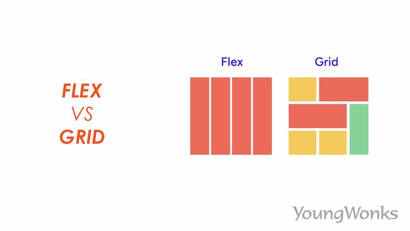
CSS Grid vs Flexbox
Both CSS Grid and Flexbox are powerful layout tools, each with its strengths and use cases. Flexbox is ideal for simpler, one-dimensional layouts, while CSS Grid excels in creating complex, two-dimensional layouts. The choice between them depends on the specific requirements of your project and the complexity of your layout. In this section, we will be comparing the features of flex and grid in detail.
Layout Control
Flexbox: Controls the layout of items along a single axis. You can specify how items are aligned, spaced, and ordered within a flex container.
CSS Grid: Offers control over both rows and columns, allowing you to define the grid structure and the placement of items within the grid cells.
Complex Layouts
Flexbox: Best for simpler layouts where elements flow in one direction. It's suitable for arranging items within a container, such as a list or a series of cards.
CSS Grid: Excels in creating complex layouts with multiple rows and columns. You can create intricate grid-based designs with ease, such as magazine layouts or dashboard interfaces.
Responsive Design
Flexbox: Suitable for creating responsive designs by adjusting the layout based on screen size or viewport dimensions. You can control how flex items wrap, align, and resize.
CSS Grid: Also great for responsive layouts, with additional features like auto-placement and media queries. You can define grid layouts that adapt to different screen sizes and orientations.
When to Use Each
Flexbox: Use it for straightforward layouts like navigation bars or arranging items within a container. It's perfect for situations where you need items to flex and adapt to different screen sizes.
CSS Grid: Opt for CSS Grid when you need more control over the layout, especially for grid-based designs with multiple columns and rows. It's ideal for creating complex layouts that require precise alignment and positioning.
Integrating JavaScript with Flexbox and CSS Grid
JavaScript can be seamlessly integrated with Flexbox and CSS Grid to create interactive and responsive layouts. For instance, you can use JavaScript to dynamically generate or modify grid items based on user input or data fetched from external sources. You can also leverage JavaScript libraries and frameworks that provide pre-built components and utilities for working with Flexbox and CSS Grid layouts, further streamlining the development process.
Examples of JavaScript-powered Layouts
Here are some examples of JavaScript-powered layouts:
- Interactive Forms: Use JavaScript to enhance form layouts with validation, auto-completion, and real-time feedback to users.
- Dynamic Content Loading: Employ JavaScript to fetch and dynamically load content into grid or flex containers without requiring a page reload.
- Drag-and-Drop Interfaces: Implement drag-and-drop functionality within Flexbox or CSS Grid layouts to allow users to rearrange elements interactively.
- Responsive Navigation Menus: Utilize JavaScript to create responsive navigation menus that adapt their layout and behavior based on the device screen size and user interactions.
Conclusion
In conclusion, it's essential to recognize the robust capabilities of both Flexbox and CSS Grid within the realm of web development. Flexbox offers unparalleled simplicity and effectiveness for crafting straightforward, one-dimensional layouts. On the other hand, CSS Grid empowers developers with its versatility and precision, making it the go-to choice for intricate, two-dimensional layouts. By comprehending the nuanced strengths of each tool, developers can aptly tailor their approach to suit the specific requirements of their projects.
Whether it's implementing responsive designs, organizing content within a grid, or fine-tuning layout structures, understanding the intricacies of Flexbox and CSS Grid ensures optimal outcomes. From defining the layout of inline elements to orchestrating complex grid-area arrangements, from setting minmax constraints to leveraging flex properties for flexible layouts, these tools offer a comprehensive toolkit for front-end developers, both seasoned professionals and beginners alike.
With support across various browsers and the availability of hacks and workarounds to overcome limitations, Flexbox and CSS Grid facilitate seamless implementation and experimentation. Whether you're prototyping concepts on CodePen or adding animations to enhance user experience, these layout models provide the foundation for creating engaging web interfaces.
So, whether you're a front-end enthusiast just beginning your journey or a seasoned developer seeking to optimize layout efficiency, understanding the intricacies of Flexbox and CSS Grid is indispensable. By embracing these tools and harnessing their capabilities, developers can unlock boundless possibilities, transforming simple markup into captivating web experiences that resonate with users across the digital landscape. Incorporating features like browser support, border-radius, and block elements further enriches the development process, ensuring compatibility and aesthetic finesse in web design endeavors.
Empower Your Child with Future-Ready Skills Through Coding
For parents seeking to enhance their children's technical skills from an early age, YoungWonks offers a variety of Coding Classes for Kids. These classes are designed to spark an interest in technology, coding, and programming, providing a strong foundation for future learning. Particularly, our Python Coding Classes for Kids focus on introducing young learners to one of the most versatile programming languages today. For students interested in a more comprehensive learning experience encompassing both front-end and back-end development, our Full Stack Web Development Classes are an ideal choice, offering a hands-on approach to building complete web applications.
Common Questions About Flexbox and CSS Grid
Is Flex better than the grid?
It depends on the specific layout requirements of your project. Flexbox is great for one-dimensional layouts, like navigation bars or lists, where items flow in a single direction. CSS Grid, on the other hand, is ideal for two-dimensional layouts with rows and columns, such as complex grids or magazine-style layouts.
Should I use grid or flex for form?
For forms, where you typically have multiple input fields arranged in a single column or row, Flexbox is usually more suitable. It allows for easy alignment of form elements and flexible resizing. However, if you have a more complex form layout with multiple columns or sections, CSS Grid might be a better choice.
Is grid slower than flex?
Generally, both Flexbox and CSS Grid offer efficient performance, and any perceived difference in speed is minimal and often negligible. The choice between them should primarily be based on your layout requirements rather than performance considerations.
Should you mix grid and flex?
Mixing Flexbox and CSS Grid can offer the best of both worlds. You can use Flexbox for smaller, one-dimensional layouts within grid items or combine Flexbox and CSS Grid for more complex layouts where each excels in its own way.
Can flex replace grid?
While Flexbox can handle many layout scenarios, it may not always be a suitable replacement for CSS Grid. Flexbox is more suitable for simpler, one-dimensional layouts, whereas CSS Grid is better suited for complex, two-dimensional layouts with more control over rows and columns.
When to use Grid vs Flexbox?
Use Flexbox for simpler layouts like navigation menus or lists, where items flow in a single direction. Use CSS Grid for more complex layouts with multiple rows and columns, such as grids of images or magazine-style pages.
How do I choose between Flexbox and CSS Grid for layout design?
Consider the layout requirements of your project. If you need flexible sizing and alignment along a single axis, choose Flexbox. For layouts with multiple rows and columns requiring precise control, opt for CSS Grid.
How do you decide whether to use CSS Grid or Flexbox for layout tasks?
Determine the complexity of your layout. For simpler, one-dimensional layouts, Flexbox is sufficient. For more intricate, two-dimensional layouts with rows and columns, CSS Grid is more appropriate.
How do you decide between using Flexbox or CSS Grid for a responsive layout?
For responsive layouts where elements need to adapt to different screen sizes or orientations, both Flexbox and CSS Grid can be effective. Consider the structure of your layout and choose the one that offers the most flexibility and control for your responsive design needs.
*Contributors: Written by Disha N; Edited by Rohit Budania; Lead image by Shivendra Singh